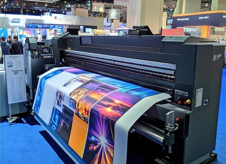

Customers form opinions quickly.
Before they read your proposal.
Before they compare your pricing.
Before they understand your service.
They evaluate how your business looks.
Your printed materials communicate messages long before conversations begin.
A blurry brochure.
A faded banner.
An inconsistent company profile.
Poor signage.
Low-quality promotional materials.
Many businesses invest heavily in websites, social media, and advertising while overlooking one of the most visible parts of their brand:
- Printed presentation. Poor font choices and missing font files
- Ignoring substrate and finish compatibility
How Creonix helps: We recommend the ideal printing method and finishing (UV lamination, matte/gloss, spot varnish, foiling, embossing) for your use-case and budget.
- Weak contrast, dark images, or poor overprint settings
The problem: Murky photos, unreadable white text over images, unexpected color knocks/overprints.
How Creonix helps: Our designers optimize artwork for legibility in real-world lighting and at different viewing distances.
- Incorrect file formats and unprintable effects.
These details may seem small—but customers notice them.
And perception influences decisions.
At Creonix Visuals, we regularly see businesses lose opportunities not because their products are weak—but because their presentation quietly reduces confidence.
The good news?
Most printing mistakes are preventable.
This guide explores the most common printing mistakes businesses make—and how to avoid them.
Why Print Quality Matters More Than Most Businesses Realize
Businesses often treat printing as a production task.
But printing is communication.
Customers interpret quality through visual cues.
Your printed materials communicate:
- Professional standards
- Attention to detail
- Reliability
- Investment level
- Brand maturity
Poor execution creates doubt.
Professional execution builds confidence.
That confidence influences sales.
Mistake #1: Choosing Price Over Print Quality
One of the most expensive mistakes businesses make is trying to reduce printing costs too aggressively.
Questions often become:
“How cheaply can we print?”
Instead of:
“How effectively will this represent the business?”
Cheap printing often results in:
- Poor color reproduction
- Thin materials
- Fading
- Weak finishing
- Low durability
Customers may never mention it.
But they feel it.
What Professional Printing Communicates
High-quality print suggests:
✓ Stability
✓ Professionalism
✓ Attention to detail
✓ Long-term thinking
Printing is not paper.
Printing is perception.
Mistake #2: Using Low-Resolution Images
Nothing makes printed materials look unprofessional faster than blurry visuals.
This mistake appears frequently in:
- Flyers
- Posters
- Company profiles
- Banners
- Brochures
- Packaging
Images designed for screens rarely print well.
Professional print production requires files optimized for output.
Signs Your Images Are Too Low Quality
- Pixelation
- Blurry edges
- Soft logos
- Distorted visuals
- Poor detail
Customers associate poor visuals with poor standards.
Mistake #3: Inconsistent Branding Across Materials
Many businesses unintentionally create multiple versions of their brand.
Examples:
Different logo versions.
Different colors.
Different fonts.
Different layouts.
Different tone.
Customers experience inconsistency as uncertainty.
Professional businesses maintain alignment.
Your brochure should feel connected to:
- Your website
- Your signage
- Your office
- Your packaging
- Your social channels
Consistency creates trust.
Mistake #4: Printing Without a Strategic Purpose
Businesses sometimes print because competitors print.
That rarely works.
Every printed material should answer:
What business objective does this support?
Examples:
Flyers → Awareness
Brochures → Education
Company Profiles → Sales
Signage → Visibility
Packaging → Experience
Professional printing starts with strategy.
Mistake #5: Trying to Fit Too Much Information
This is one of the most common brochure and flyer mistakes.
Businesses try to include:
Everything.
Customers read:
Almost nothing.
Overloaded materials create confusion.
Strong print prioritizes:
Clarity.
Hierarchy.
Focus.
White space improves readability.
Mistake #6: Ignoring Paper and Material Selection
Material influences perception.
The same design printed on different materials creates completely different experiences.
Customers notice:
- Texture
- Weight
- Finish
- Durability
Premium presentation often begins with material selection.
This applies to:
- Business cards
- Company profiles
- Brochures
- Packaging
- Corporate documents
Mistake #7: Weak Typography Choices
Fonts influence perception.
Poor typography creates:
- Confusion
- Clutter
- Poor readability
- Reduced professionalism
Common typography problems:
Using too many fonts.
Tiny text.
Weak spacing.
Overdecorated styles.
Professional print prioritizes readability.
Mistake #8: Ignoring Finishing Details
Many businesses underestimate finishing.
Finishing includes:
- Lamination
- Trimming
- Binding
- Mounting
- Surface treatment
Finishing often determines whether materials feel premium.
Professional finishing improves:
✓ Durability
✓ Presentation
✓ Customer experience
Mistake #9: Poor Color Management
Customers expect consistency.
If your:
Logo looks different.
Posters look inconsistent.
Brochures vary.
Customers notice.
Color consistency strengthens recognition.
Professional print workflows reduce this problem.
Mistake #10: Using Generic Templates That Look Like Everyone Else
Templates save time.
But generic templates reduce distinction.
Businesses compete for attention.
If materials look identical to competitors, customers remember no one.
Professional design should reflect:
Your positioning.
Your customers.
Your personality.
Your goals.
Mistake #11: Printing Without Thinking About Customer Experience
Many businesses ask:
What do we want to say?
Better question:
What does the customer need to experience?
Printed materials should guide users.
Strong materials feel:
Easy.
Useful.
Organized.
Clear.
Mistake #12: Forgetting Physical Visibility Matters
Businesses sometimes invest entirely in digital presence.
But customers still experience brands physically.
Examples:
Signage.
Packaging.
Office branding.
Promotional materials.
Events.
Physical experiences influence credibility.
How These Printing Mistakes Quietly Reduce Sales
Poor printing rarely causes immediate rejection.
Instead it creates:
Less trust.
More hesitation.
Lower perceived value.
Weaker referrals.
Reduced conversion.
These small effects accumulate.
Professional businesses protect perception.
The Professional Printing Checklist
Before approving print materials ask:
✓ Is branding consistent?
✓ Are images high resolution?
✓ Is information clear?
✓ Does material quality match positioning?
✓ Is the print professionally finished?
✓ Is the objective clear?
✓ Does this reflect our business standards?
The Difference Between Printing and Strategic Printing
Printing:
Produces materials.
Strategic printing:
Creates business outcomes.
The strongest businesses understand that every printed interaction influences customer perception.
That shift changes decisions.
How Creonix Visuals Helps Businesses Avoid Costly Printing Mistakes
At Creonix Visuals, we do more than print.
We help businesses improve how customers experience their brand.
Solutions include:
✓ Digital Printing
✓ Brochure Printing
✓ Flyer Printing
✓ Company Profiles
✓ Large Format Printing
✓ Office Branding
✓ Packaging Support
✓ Promotional Merchandise
✓ Corporate Printing Solutions
Our focus is helping businesses create materials that look professional, communicate clearly, and support growth.
Final Thoughts
Customers may never explain why they trust one business more than another.
But presentation plays a major role.
Every brochure.
Every poster.
Every sign.
Every company profile.
Every printed interaction communicates something.
The question is:
What is your business communicating?
Avoiding common printing mistakes does more than improve appearance.
It improves trust.
And trust drives growth.
Creonix Visuals helps businesses create printed experiences that strengthen brands and leave stronger impressions.
FREQUENTLY ASKED QUESTIONS
1. Why do printed materials affect business perception?
Printed materials communicate professionalism and attention to detail.
2. What is the biggest printing mistake businesses make?
Prioritizing cost over presentation quality.
3. Why do brochures sometimes look unprofessional?
Low-quality images, poor layouts, and weak finishing.
4. Does paper quality matter?
Yes. Material selection influences customer perception.
5. Can poor printing reduce sales?
Indirectly, yes. Presentation affects trust.
6. How often should printed materials be updated?
Usually every 12–24 months or after brand updates.
7. Does professional printing improve branding?
Yes. Consistency strengthens recognition.
8. Why is color consistency important?
Customers associate consistency with professionalism.
9. What print materials matter most?
Company profiles, brochures, signage, and branded materials.
10. How do I choose a printing partner?
Look for quality, consistency, production capability, and strategic guidance.
11. Does finishing really matter?
Yes. Finishing affects durability and perceived quality.
12. What makes Creonix different?
Creonix approaches printing as a branding and business growth tool.